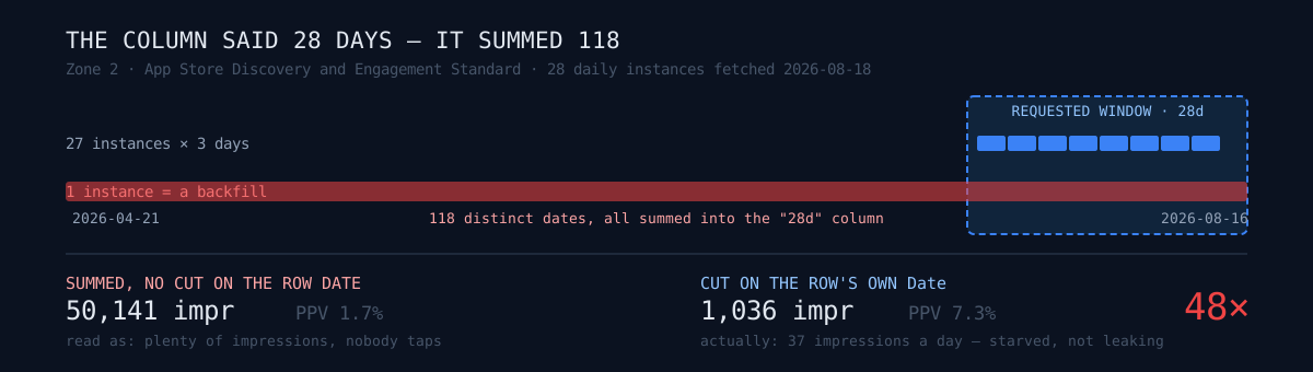
There is a column in your automated report that says "last 28 days." When did you last check that it really contains 28 days?
I never had. Not even after digging a different bug out of the same report two weeks earlier and writing a post about it.
The app that looked worst in the report
Here is the funnel table from my daily report, verbatim, dated 2026-08-13.
| app                        | days | Impr  | PageView | PPV/Imp |
|----------------------------|-----:|------:|---------:|--------:|
| Plotta GPS: Territory Walk |   28 | 56006 |     5816 |   10.4% |
| Zone 2: Heart Rate Trainer |   28 | 50141 |      842 |    1.7% |
| Reelo: AI Video Editor     |   28 | 26661 |      694 |    2.6% |
The second row kept bothering me. Second-highest impressions in the fleet, and a 1.7% tap-through. Plotta, the app above it, converts at 10.4% — six times better. The reading writes itself: an app that surfaces in search but whose icon and first screenshot fail to hold anyone. That is a textbook store-asset problem, and with 50,000 impressions there is obviously enough traffic to A/B test the fix.
All three of those sentences were wrong.
That app's actual impressions over the last 28 days: 1,036. Thirty-seven a day. The assets were not failing to convert attention. There was no attention.
How far the earlier conclusion held
In the earlier post I found that App Store Connect's ONGOING analytics reports restate the trailing three days in every instance. Sum the instances naively and each day gets counted two or three times. Measured multiplier: 2.76–3.01x.
And I reassured myself with one sentence: numerator and denominator inflate by the same factor, so the ratios are untouched.
I re-measured three apps today. That sentence was exactly right.
                summed (dupes kept)        after dedupe
Zone 2     impr  3,298  pv  241  7.3%     1,036    76  7.3%
Plotta     impr 50,334  pv 5,310 10.5%   15,577 1,640 10.5%
Reelo      impr 27,232  pv  593  2.2%     8,235   184  2.2%
Impressions are inflated about 3.2x across the board, and the page-view rate matches to the decimal. Restatement is an honest kind of error. It duplicates every row equally.
But the report printed 50,141 for Zone 2. Not the deduped 1,036, and not the un-deduped 3,298 either. Something was adding another 15x.
The window was never closed
So I opened the instances one at a time and printed which dates were inside them.
== Zone 2: instances=28  date span=2026-04-21..2026-08-16  distinct days=118
   total, no cut on row Date:  impr=50,158  pv=854
   inst ('2026-08-17', rows=90, days=3, '2026-08-14'..'2026-08-16')
   inst ('2026-08-16', rows=95, days=3, '2026-08-13'..'2026-08-15')
50,158 — the same number the report printed, give or take the five days between the two runs. There it was.
A daily instance normally carries three days. But the 28 instances together spanned 21 April to 16 August: 118 distinct dates. Somewhere in that set sits a backfill instance hauling months of history along with it.
Which produces the trap:
- You select instances by
processingDate— the day Apple generated the file. Picking the last 28 days of instances is correct. - The rows inside them each carry their own
Date. If you do not cut on that too, April rows land in a total labelled "last 28 days."
Plotta was leaking as well. Its 28 instances covered 87 days, and its uncut total was 59,557. It just did not matter as much: Plotta's recent traffic dominates, so the leak added only 18%. Zone 2's recent window was nearly empty, so the leak was almost the entire number.
Decomposed per app, the two defects separate cleanly:
| app | restatement | window leak | total in the report |
|---|---|---|---|
| Plotta | ×3.2 | ×1.18 | ×3.6 |
| Reelo | ×3.3 | ×1.0 | ×3.2 |
| Zone 2 | ×3.2 | ×15.2 | ×48.4 |
Why this one is worse
Restatement multiplies every app by the same 3x. A shared factor means ratios survive, rankings survive, and you only have to throw away conclusions built on absolute values.
The window leak has a different multiplier for every app, because every app has a different backfill depth and a different ratio of recent traffic to historical traffic. When the factor varies, nothing survives.
- Zone 2's page-view rate collapsed from 7.3% to 1.7%. That is not noise. It is a rate for a different period — four months of cumulative conversion sitting in the slot labelled "last 28 days," from an era when the app was a different app.
- Cross-app comparison dies too. Read Plotta (×3.6) and Zone 2 (×48.4) side by side in one table and you have invented a gap that does not exist.
"Everything is 3x too big" gets noticed. "Everything is wrong by a different amount" does not, because it still looks like a plausible table.
The cost landed downstream, not in the report
If I had only been reading these numbers, the damage would have been small. The problem is that they were the input to a power calculation.
That same week I was designing store-screenshot A/B tests (Product Page Optimization). The method: run a 2-proportion z-test per app, and only run experiments on apps where a realistic lift becomes readable inside the 90-day cap. Back then the calculator took the report's impression count straight in as the sample size.
Feed it inflated impressions and the calculator will happily approve experiments that cannot exist. Before I added guards, an app with 31 impressions over 28 days passed as "able to detect a +20% lift." Its page-view rate read 45%, computed from single-digit events — the ratio was pure noise.
So the calculator got sample guards:
- Fewer than 300 observed impressions and the app is excluded from any verdict; below that, the rate is noise rather than signal.
- Minimum 10 events per arm.
- The input is the deduped snapshot JSON, never the daily report table.
One more thing only became visible after the fix. Solve the formula for 90 days, two arms, 80% power, α=0.05 and impressions cancel out of numerator and denominator, leaving MDE = sqrt(9.6 / installs_27d). The binding constraint was never impressions. It was installs. The column I had stared at for four months was not the number that decides whether an app can be judged at all. That cancellation also means the current calculator is immune to this defect — it no longer touches the value that was wrong.
With the guards and the dedupe both in place, 4 apps out of 43 actually got experiments (MDE 28–39%). Zone 2 is not among them: single-digit installs over 27 days put its MDE above 98%, so it could spend the full 90 days and earn nothing but "undetermined." Had I used the inflated table, many more would have qualified, and a good share of them would have spent the full 90 days to earn a "no difference" that means nothing. A failed experiment teaches you something. An experiment that never had the power to detect anything does not.
The fix
It is under ten lines, and the point is that the field you select instances by and the field you cut rows by are not the same field.
def dedupe_restated(instances, date_field="Date", lo=None, hi=None):
    """Collapse restatements and cut the window, in one pass.

    1) Instances restate the trailing ~3 days, so summing them counts the
       same day 2-3x. Walk processingDate ascending and let the last win.
    2) Cut the window on the row's own Date, not on the instance's
       processingDate. A backfill instance drags in months of history.
    """
    latest = {}
    for _pd, inst_id in sorted(instances):
        for row in download_segments(inst_id):
            d = row.get(date_field, "")
            if lo and d < lo:      # <- these two lines were the 48x
                continue
            if hi and d > hi:
                continue
            key = tuple(sorted((k, v) for k, v in row.items()
                               if k not in ("Counts", "Unique Counts")))
            latest[key] = row      # <- this one was the 3x
    return list(latest.values()), {r[date_field] for r in latest.values()}
Honestly, what I still do not know
- Why only Zone 2 has a backfill reaching to April. It could be a re-created report request, it could be reprocessing on Apple's side. I did not establish it. The good news is that the defence does not depend on the cause: once you cut on the row's own Date, backfill depth stops mattering.
- Which copy of the code produced the 2026-08-13 report. The fix was committed on 08-04, yet the report kept printing pre-fix numbers through 08-13. The same project exists on two machines with divergent histories, and a scheduled job was pointing at an old path during that window. I have a suspicion and no proof.
- I have not made the real fix yet. The code above corrects the values; it does nothing to make the next silent version loud. The report should testify about its own window — print
min(Date),max(Date)and the count of distinct days next to the total instead of a hardcoded "28d" label. That one line would have made this post unnecessary.
Check your own
If your pipeline aggregates a period out of an external analytics API, three questions:
- Is the field you cut the window on the day the data was produced, or the day the event happened? When those differ, the second one is the correct cut.
- Have you ever printed the date range you actually summed?
min(Date),max(Date),len(set(Date)). If it disagrees with the label, that is your answer. - Do the consumers of that number have sample guards? An inflated metric is far more expensive entering a calculator than entering your eyes.
One line to keep: worse than an inflated metric is a metric inflated differently per app. The first one gets caught. The second one just looks like a table.
Related: I judged two months on numbers inflated 3× · I designed an experiment; it was statistically impossible