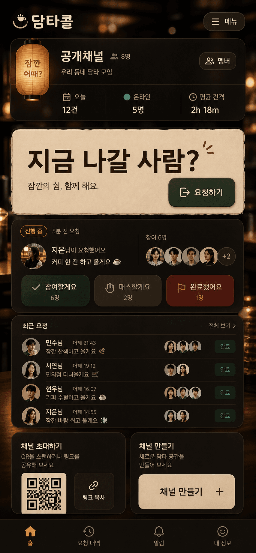
오늘 한 작업은 단순한 리스킨이 아니었습니다. 담타콜을 bungeo 수준의 완성도로 끌어올리되, 게임처럼 보이거나 bungeo의 소재를 복사하지 않는 것이 목표였습니다.
핵심은 한 문장입니다.
bungeo의 표면을 베끼지 말고, bungeo가 가진 품질 기준을 담타콜의 실제 사용 흐름으로 번역한다.
그래서 프롬프트도 "예쁘게"가 아니라 기능, 분위기, 금지 항목, 구현 제약, 검증 기준으로 썼습니다. 아래가 실제로 사용한 전문입니다.
결과
적용 대상은 휴식 요청 도구입니다. 사용자는 채널을 만들고, 같은 링크를 공유하고, "지금 나갈 사람?" 요청을 보내고, 참여/패스/완료 상태를 남깁니다.
디자인 결과는 다음 방향으로 잡았습니다.
- 첫 화면이 랜딩 페이지가 아니라 바로 쓸 수 있는 앱 표면이어야 한다.
- 요청 버튼이 화면의 명확한 중심이어야 한다.
- 카페/오피스 휴식 분위기는 배경과 재질감으로만 주고, 기능 위계를 흐리지 않아야 한다.
- 모바일에서 하단 고정 요소가 요청 카드나 기록을 가리지 않아야 한다.
- bungeo의 "손맛, 깊이, 완성도"는 가져오되, 점수판/게임/HUD 문법은 버려야 한다.
프롬프트 1 - UI 콘셉트
Use case: ui-mockup
Asset type: production design concept for a Korean web app primary screen and lobby mood
Primary request: Create a high-end mobile-first product UI concept for "담타콜", a web app where a small group opens a channel and sends a short break request. It should feel as polished and tactile as the referenced bungeo.ootssu.com concept, but not like a game. Translate the bungeo quality into a premium late-night cafe / office break call station: warm paper lantern and espresso bar atmosphere, tactile panels, rich lighting, strong primary action, compact app surface, delightful but practical.
Reference image role: quality benchmark for polish, tactile depth, framing, strong buttons, Korean app personality. Do not copy game mechanics, snacks, scoreboards, or title style directly.
Required screen content: brand "담타콜", channel name "공개채널", large primary action "지금 나갈 사람?", current request state with requester and join/pass/complete controls, small stats for 오늘/온라인/평균 간격, request history rows, participant avatars, invite/share controls with QR area. Also show a lobby/create channel mood in small secondary area if composition allows.
Style/medium: high-fidelity app UI mockup, code-native controls, not a static poster; warm cinematic cafe lighting, tactile material surfaces, Korean web-app polish.
Composition/framing: tall mobile-first screen with a focused app frame, next content visible, stable UI panels, strong thumb-friendly bottom actions, no marketing hero, no decorative card grid.
Color palette: deep espresso brown, cream paper, muted teal accent, amber light, red only for secondary caution/decline. Avoid purple, blue gradients, beige-only monotone, and generic SaaS white dashboard.
Typography: bold Korean display for brand and action; compact readable UI text; no negative letter spacing.
Constraints: keep controls realistic and implementable with React/CSS/lucide icons; avoid fake unreadable tiny text; no hero eyebrow/kicker/badge; no placeholder boxes; no text overlap; no nested cards; no animals or creature mascots; no score/game framing; no bungeo/snack assets; no ootssu.com domain text in the visible UI.
이 프롬프트에서 중요한 문장은 "bungeo처럼"이 아닙니다. 중요한 건 바로 다음 문장입니다. "but not like a game." 품질 기준은 가져오지만 도메인 문법은 버리라는 제약입니다.
왜 이렇게 썼나
첫 줄부터 ui-mockup이라고 박은 이유는 결과물이 포스터가 되지 않게 하려는 것입니다. 이미지 모델은 "고급스럽게"라고 하면 화면이 아니라 광고 비주얼을 만들기 쉽습니다. 담타콜은 공유해서 쓰는 도구이므로 첫 화면에서 버튼, 상태, 기록, 초대 흐름이 실제 컨트롤처럼 보여야 했습니다.
Reference image role을 따로 둔 이유도 같습니다. 참고 이미지를 주면 모델은 소재까지 복사하려고 합니다. 그래서 참고 이미지의 역할을 "품질 기준"으로 한정했습니다. bungeo의 간식, 게임 점수판, 타이틀 스타일은 가져오지 말고, 촉감 있는 패널과 강한 버튼, 한국어 앱의 성격만 가져오라고 지시했습니다.
Required screen content는 기능의 보험입니다. 담타콜의 본질은 하나의 예쁜 버튼이 아니라 요청, 응답, 완료, 기록, 초대의 루프입니다. 이 목록이 없으면 모델은 큰 버튼 하나와 분위기 좋은 배경으로 끝냅니다. 보기에는 좋지만 실제 구현에는 쓸모가 작습니다.
Constraints는 결과물의 품질을 지키는 금지 목록입니다. 특히 아래 제약들이 실제 코드 작성까지 영향을 줬습니다.
code-native controls: 텍스트와 버튼을 이미지에 박지 않고 React/CSS에서 렌더링한다.no text overlap: 긴 한국어 문구와 모바일 폭을 먼저 의심한다.no nested cards: 카드 안에 카드를 쌓아 AI 대시보드처럼 보이는 패턴을 막는다.no score/game framing: bungeo의 품질은 가져오되 게임 UI가 되지 않게 한다.no ootssu.com domain text: 공개 공유 화면에서 도메인 노출을 최소화하려는 운영 맥락을 반영한다.
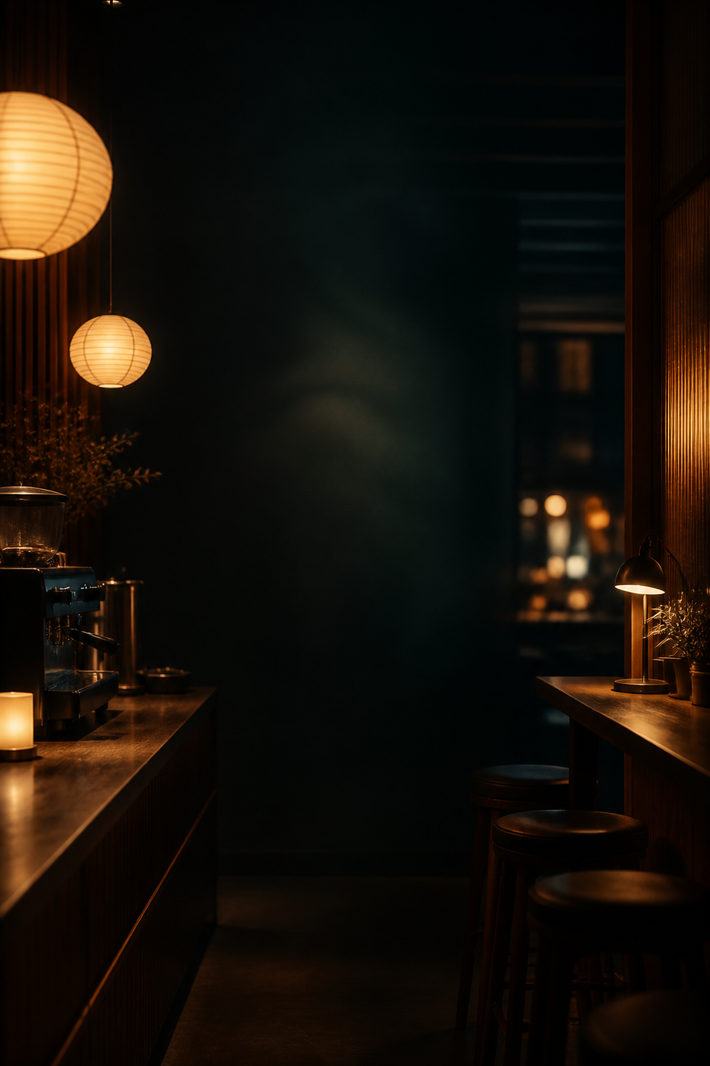
프롬프트 2 - 배경 에셋
Use case: product-mockup
Asset type: background image for a Korean web app UI
Primary request: Create a premium late-night cafe and office break-call station background for the web app "담타콜". No UI panels, no readable text, no logos. Warm espresso bar lighting, paper lantern glow, dark wood counter, soft amber bokeh, subtle teal shadows, a quiet modern Korean office-cafe mood. It should support overlaying code-native app UI on top.
Style/medium: cinematic high-quality raster background, realistic but slightly stylized, refined product-app atmosphere.
Composition/framing: tall mobile-first composition, central area should be darker and calmer for UI legibility, edges may show warm lights and counter details. No people in foreground.
Color palette: deep espresso brown, warm amber, cream highlights, muted teal shadows.
Constraints: no text, no watermark, no app screens, no QR, no buttons, no labels, no animal/creature mascots, no snacks/food game objects, no clutter. Keep background tasteful and not too busy.
배경은 UI 콘셉트와 분리했습니다. 이유는 간단합니다. 앱에서 클릭되는 것은 이미지가 아니라 DOM이어야 합니다. 배경 이미지에 버튼, QR, 텍스트가 들어가면 구현 단계에서 전부 가짜가 됩니다.
그래서 배경 프롬프트에는 금지 항목을 더 강하게 넣었습니다.
No UI panelsno readable textno logosno app screensno QRno buttonsno labels
이렇게 해야 배경은 분위기만 맡고, 실제 인터랙션은 코드가 맡습니다.
1원칙으로 보면
담타콜의 1원칙은 "휴식 요청을 빠르게 만들고, 사람들이 참여 여부를 부담 없이 남기게 한다"입니다. 디자인은 그 행동을 더 쉽게 만들 때만 의미가 있습니다.
그래서 이번 고품질화에서 버린 것도 많습니다.
- 큰 마케팅 히어로를 만들지 않았다. 첫 화면은 제품 설명이 아니라 사용 화면이어야 했다.
- 이미지 속 텍스트를 쓰지 않았다. 실제 상태와 채널명이 바뀌어야 하기 때문이다.
- 과한 장식 카드를 깔지 않았다. 요청 카드, 현재 상태, 기록이 서로 경쟁하면 안 된다.
- 프로필 사진 스타일을 세게 밀지 않았다. 작은 그룹 도구에서는 이니셜과 상태만으로 충분하다.
- bungeo의 게임성은 가져오지 않았다. 담타콜은 놀이가 아니라 짧은 조율 도구다.
좋은 프롬프트는 "무엇을 만들까"보다 "무엇을 만들지 말까"를 더 정확하게 말합니다. 이번에도 결과를 바꾼 건 취향 표현이 아니라 금지 조건과 구현 제약이었습니다.
코드에 남긴 기준
이미지 콘셉트는 방향을 잡는 용도였고, 최종 화면은 CSS와 React 구조로 구현했습니다. 코드에 남긴 기준은 이렇습니다.
- 배경 에셋은
public/assets/damta-cafe-bg.png로 두고, 주요 UI는 코드 네이티브로 렌더링한다. - 요청 버튼은 엄지로 누르기 쉬운 크기와 대비를 유지한다.
- 모바일 요약 바가 본문을 가리지 않도록 640px 이하에서는 숨긴다.
- 기록 행의 장식 화살표처럼 기능 없는 클릭 암시는 제거한다.
- 색은 진한 에스프레소, 크림 종이, 앰버 조명, muted teal을 중심으로 두고 보라/파랑 그라데이션 계열을 피한다.
- 배포 전
typecheck,lint,build, Playwright 기반 기본 흐름 검증을 통과시킨다.
검증한 사용자 흐름은 간단했습니다. 공개 채널에서 요청을 만들고, 패스하고, 참여하고, 완료 처리한 뒤 다시 새 요청을 만드는 루프입니다. 디자인이 예뻐도 이 루프가 깨지면 실패입니다.
다시 쓸 수 있는 짧은 버전
실제로 다음 앱에 붙일 때는 이렇게 줄여 쓸 수 있습니다.
Reference the quality bar of [reference app], but do not copy its domain, mechanics, assets, or visual jokes.
Translate its polish into this product's first-principles workflow.
The first viewport must be the usable app surface, not a landing page.
List the real controls and states that must appear on screen.
Use image generation only for non-interactive atmosphere or assets.
Render all text, buttons, state, and data in code.
Name the anti-patterns explicitly: no fake text, no nested cards, no decorative dashboard clutter, no overlapping mobile text, no visual affordance without behavior.
Verify the shipped UI with typecheck, build, browser screenshots, and the core user loop.
이게 이번 작업의 핵심입니다. "bungeo처럼"은 방향일 뿐이고, 실제로 품질을 만든 것은 복사 금지, 기능 우선, 코드 구현 가능성, 모바일 검증이었습니다.