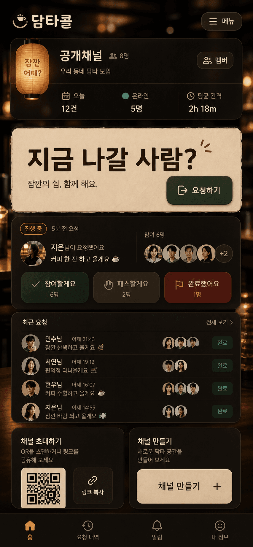
This was not a simple reskin. The goal was to raise Damta to the quality bar of bungeo, without making Damta look like a game and without copying bungeo's surface details.
The core sentence was:
Do not copy bungeo's surface. Translate its quality bar into Damta's actual workflow.
So the prompt was not "make it beautiful." It specified function, mood, bans, implementation constraints, and verification criteria. Below is the exact text I used.
Result
Damta is a short-break request tool. A user creates a channel, shares the link, sends "지금 나갈 사람?", and people mark join, pass, or complete.
The redesign aimed for these constraints:
- The first screen must be the usable app surface, not a landing page.
- The request button must be the visual center.
- The cafe/office-break mood should come from background and material treatment, without blurring the workflow.
- Mobile fixed elements must not cover the request card or history.
- The tactile depth and polish of bungeo should carry over, but game scoreboards, HUD language, and mechanics should not.
Prompt 1 - UI Concept
Use case: ui-mockup
Asset type: production design concept for a Korean web app primary screen and lobby mood
Primary request: Create a high-end mobile-first product UI concept for "담타콜", a web app where a small group opens a channel and sends a short break request. It should feel as polished and tactile as the referenced bungeo.ootssu.com concept, but not like a game. Translate the bungeo quality into a premium late-night cafe / office break call station: warm paper lantern and espresso bar atmosphere, tactile panels, rich lighting, strong primary action, compact app surface, delightful but practical.
Reference image role: quality benchmark for polish, tactile depth, framing, strong buttons, Korean app personality. Do not copy game mechanics, snacks, scoreboards, or title style directly.
Required screen content: brand "담타콜", channel name "공개채널", large primary action "지금 나갈 사람?", current request state with requester and join/pass/complete controls, small stats for 오늘/온라인/평균 간격, request history rows, participant avatars, invite/share controls with QR area. Also show a lobby/create channel mood in small secondary area if composition allows.
Style/medium: high-fidelity app UI mockup, code-native controls, not a static poster; warm cinematic cafe lighting, tactile material surfaces, Korean web-app polish.
Composition/framing: tall mobile-first screen with a focused app frame, next content visible, stable UI panels, strong thumb-friendly bottom actions, no marketing hero, no decorative card grid.
Color palette: deep espresso brown, cream paper, muted teal accent, amber light, red only for secondary caution/decline. Avoid purple, blue gradients, beige-only monotone, and generic SaaS white dashboard.
Typography: bold Korean display for brand and action; compact readable UI text; no negative letter spacing.
Constraints: keep controls realistic and implementable with React/CSS/lucide icons; avoid fake unreadable tiny text; no hero eyebrow/kicker/badge; no placeholder boxes; no text overlap; no nested cards; no animals or creature mascots; no score/game framing; no bungeo/snack assets; no ootssu.com domain text in the visible UI.
The important phrase is not "like bungeo." The important phrase comes right after it: "but not like a game." It asks for the quality bar while rejecting the domain language.
Why It Was Written This Way
The prompt starts with ui-mockup because the output needed to be an app surface, not a poster. If you only ask for "premium," image models tend to drift toward advertising visuals. Damta is a tool people share and use, so the first screen had to show buttons, state, history, and invitation mechanics as realistic controls.
Reference image role is separated for the same reason. If a model gets a reference, it tries to copy the material details. I limited the reference to "quality benchmark": tactile panels, strong buttons, Korean app personality, and framing. Not snacks, scoreboards, mechanics, or title treatment.
Required screen content protects the workflow. Damta is not one beautiful button. It is a loop: request, response, completion, history, invite. Without that list, the model will often produce a large button on a pretty background. It may look good, but it is not enough to implement.
The Constraints section is the quality gate. These lines directly affected the shipped code:
code-native controls: text and buttons are rendered in React/CSS, not baked into an image.no text overlap: Korean copy and mobile width were treated as risks from the beginning.no nested cards: prevents the generic AI-dashboard look.no score/game framing: imports bungeo's polish without turning Damta into a game.no ootssu.com domain text: reflects the operational requirement to avoid unnecessary domain exposure in the shared view.
Prompt 2 - Background Asset
Use case: product-mockup
Asset type: background image for a Korean web app UI
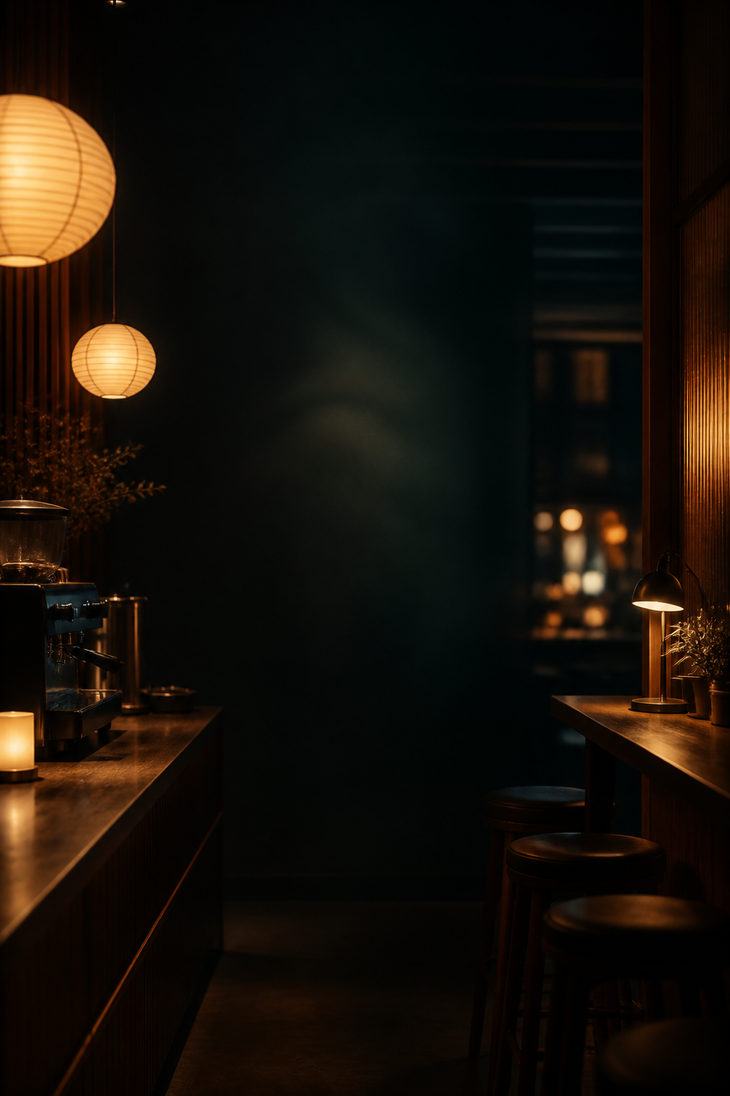
Primary request: Create a premium late-night cafe and office break-call station background for the web app "담타콜". No UI panels, no readable text, no logos. Warm espresso bar lighting, paper lantern glow, dark wood counter, soft amber bokeh, subtle teal shadows, a quiet modern Korean office-cafe mood. It should support overlaying code-native app UI on top.
Style/medium: cinematic high-quality raster background, realistic but slightly stylized, refined product-app atmosphere.
Composition/framing: tall mobile-first composition, central area should be darker and calmer for UI legibility, edges may show warm lights and counter details. No people in foreground.
Color palette: deep espresso brown, warm amber, cream highlights, muted teal shadows.
Constraints: no text, no watermark, no app screens, no QR, no buttons, no labels, no animal/creature mascots, no snacks/food game objects, no clutter. Keep background tasteful and not too busy.
The background prompt is separate because clickable UI should be DOM, not pixels. If the background contains buttons, QR codes, labels, or fake panels, the implementation inherits dead UI.
That is why the bans are stricter here:
No UI panelsno readable textno logosno app screensno QRno buttonsno labels
The background handles atmosphere. The code handles interaction.
First Principles
Damta's first principle is: make it fast to ask for a short break and easy for people to mark whether they are in.
That shaped what I removed:
- No marketing hero. The first viewport needed to be the product, not the pitch.
- No text baked into imagery. Channel names and state must change.
- No decorative card stack. The request, current state, and history should not compete.
- No heavy profile-photo system. For a small-group tool, initials and status are enough.
- No bungeo game language. Damta is a coordination tool, not a game.
A good prompt says "what not to make" more precisely than "what to make." Here again, the result changed because of bans and implementation constraints more than taste adjectives.
What Stayed In Code
The image concept set direction. The shipped UI was implemented in React and CSS.
The concrete rules that stayed:
- The background asset lives at
public/assets/damta-cafe-bg.png; the core UI is rendered as code-native controls. - The request button keeps thumb-friendly size and high contrast.
- The mobile summary bar is hidden below 640px so it does not cover the request card.
- Decorative affordances without behavior, like the dead chevron in the history row, were removed.
- The palette centers on espresso, cream paper, amber light, and muted teal, while avoiding purple/blue gradients.
- Before deploy, the app passed
typecheck,lint,build, and a browser-driven core-flow test.
The browser flow was simple: create a request in the public channel, pass, join, complete, then create the next request. A design that breaks that loop fails even if the screenshot is attractive.
The Reusable Short Version
For the next app, the compact prompt becomes:
Reference the quality bar of [reference app], but do not copy its domain, mechanics, assets, or visual jokes.
Translate its polish into this product's first-principles workflow.
The first viewport must be the usable app surface, not a landing page.
List the real controls and states that must appear on screen.
Use image generation only for non-interactive atmosphere or assets.
Render all text, buttons, state, and data in code.
Name the anti-patterns explicitly: no fake text, no nested cards, no decorative dashboard clutter, no overlapping mobile text, no visual affordance without behavior.
Verify the shipped UI with typecheck, build, browser screenshots, and the core user loop.
That is the useful part of this redesign. "Make it like bungeo" was only a direction. The real quality came from copy bans, workflow-first design, implementation realism, and mobile verification.