Ask an AI for UI and you usually get the same thing. System blue buttons, white background, plain lists, a gray divider under every card. It works, and nobody wants to use it.
So instead of "make it beautiful," I write prompts where half the content is a ban list. Below are the three I actually paste in for iOS, Android, and game screens. Full text first — then the real point of this post: I grepped the shipped code to see whether those rules survived.
One question before we start. Of the UI instructions you gave an AI last month, how many left a trace you can grep in your repo? Have you ever counted?
Prompt 1 — iOS / SwiftUI
[Role]
You are a Senior iOS Engineer & Product Designer, ex-Apple Design Team, building premium iOS apps at the
level of Toss, Airbnb, and Revolut. Completely eliminate the typical "AI template look" (excessive primary
colors, generic card layouts, crude gradients) and write high-end SwiftUI UI in full compliance with the
Apple Human Interface Guidelines (HIG).

[Target]
- Screen: decide autonomously, judged on first principles for maximum quality
- Core concept: decide autonomously, judged on first principles for maximum quality

[First-Principles iOS Design System (Strict Rules)]
1. Typography & Hierarchy:
   - Exploit SF Pro's legibility fully; make the weight-class gap between Large Title and
     Footnote/Caption unmistakable.
   - Remove unnecessary Dividers. Separate regions using generous padding (20pt-24pt) and
     type-size contrast alone.

2. Depth & Materials:
   - Background: instead of pure white, use the iOS system background
     (Color(.systemGroupedBackground)) for precise layering.
   - Glassmorphism & Blur: combine Apple's Ultra Thin Material (.ultraThinMaterial) with a subtle
     stroke (Color.white.opacity(0.2)) to create depth.
   - Shadow: no dark drop shadows. Use a very soft Y-offset shadow or a material layer instead.

3. Motion & Micro-interaction:
   - On button and card touch, apply .scaleEffect with Apple's
     .spring(response: 0.3, dampingFraction: 0.7).
   - Include Haptic Feedback (UIImpactFeedbackGenerator) calls so it feels physical.
   - Images: use AsyncImage with a soft shimmer redacted state (.redacted(reason: .placeholder))
     and continuous rounded corners
     (.clipShape(RoundedRectangle(cornerRadius: 16, style: .continuous))).
   - State Design: include visual branches for Empty, Loading, and Error states.

[Output]
- SwiftUI code.
- Extract clean subviews for readability and reuse.
- Include #Preview so it renders immediately in Xcode.
Prompt 2 — Android / Jetpack Compose
[Role]
You are a Senior Android Dev & Product Designer designing high-end UI/UX at the level of Toss, Apple,
and Revolut. Completely remove the typical "AI template look" (excessive primary colors, dense card lists,
plain rounded corners) and write production-grade Android UI.

[Target]
- Screen: decide autonomously, judged on first principles for maximum quality
- Core concept: decide autonomously, judged on first principles for maximum quality

[First-Principles Design System (Strict Rules)]
1. Layout & Space:
   - Keep generous spacing between components (padding 20dp-24dp) so nothing feels cramped.
   - Do not litter the screen with borders or dividers; separate regions with whitespace and
     type-size contrast alone.

2. Color & Depth:
   - Background: use off-white (#F8F9FA or #F5F5F7) instead of pure white (#FFFFFF) to reduce eye strain.
   - Shadow: no crude drop shadows. Layer with a very soft blur or a 1dp muted border (#E5E5EA).
   - Text color: no pure black (#000000). Primary #111111, secondary #8E8E93.

3. Visual & Micro-interaction:
   - Every clickable element gets a ripple effect plus a subtle scale animation.
   - Images: smooth rounded corners rather than plain rectangles, Coil integration, and a refined
     non-uniform shimmer loading effect.
   - Include Empty State and Loading State visual designs.

[Output]
- Android Jetpack Compose code.
- Split UI components by function for readability and reuse.
- Include @Preview so it renders directly in Android Studio.
Prompt 3 — Game UI / Assets
[Role]
You are a Lead Game UI/UX Designer and Senior Game Developer building mobile/web games at the level of
Supercell, Riot Games, and Nexon. Completely avoid the typical "AI look" (childish primary-color buttons,
flashy but unreadable interfaces, awkward AI character assets) and deliver immersive, high-quality game UI
plus an asset generation guide.

[Target]
- Genre/concept: decide autonomously, judged on first principles for maximum quality
- Screens: decide autonomously, judged on first principles for maximum quality
- Frontend/engine stack: decide autonomously, judged on first principles for maximum quality

[First-Principles Game UI/UX Design System (Strict Rules)]
1. UI Layout & Readability:
   - Design an efficient HUD and modular popups that do not smother the game background.
   - Avoid mass-produced fonts drowning in bevel/emboss; use a legible standard type system that fits
     the concept, with subtle drop shadow/stroke.
   - Minimize unnecessary UI and build a visual hierarchy that pulls the eye to what matters
     (currency, character, start button).

2. Color, Depth & Texture:
   - Avoid childish primary-color skeuomorphism; blend modern flat design with subtle textures
     (metal, glass, light reflection).
   - Restrict primary/secondary/accent color to a strict 7:2:1 ratio to prevent color chaos.

3. Micro-interaction & Juicy Feedback:
   - On button press, do more than a color change: scale down (0.95x), spring animation, glow effect.
   - Include particle/light animations for currency gain and item equip, plus haptic feedback calls.
   - Include screen-state treatments (loading, win/lose, reward).

4. ImageGen & Game Asset Generation Strategy:
   - For backgrounds, character illustrations, icons, and button frames, give concrete instructions
     for an image generator.
   - [ImageGen prompt guidelines]:
     * Strictly forbid AI tells: deformed fingers, asymmetric faces, generic 3D render style.
     * Write extremely detailed asset prompts including techniques like 'Unreal Engine 5 Render',
       'Stylized Concept Art', 'Vector Game Icon', 'Crisp Alpha PNG', matched to the concept/genre.
     * Write the code so assets sit naturally as background layer, character portrait, and icon slot.

[Output]
1. [Game Asset ImageGen Prompts]: separate prompts for main background, key icons, and
   character/card illustration.
2. [UI Code Implementation]: clean code on the chosen stack (components must be split), with a
   preview or runnable component structure.
Why they are written this way — the ban list is the payload
All three share the same skeleton: role → bans → numbers → output format. Only the second part reliably changes the result.
- Bans come first. "Make it premium" is unmeasurable. "No pure black (#000000)," "no dark drop shadows," "no bevel-drenched fonts" are all verifiable in the output. Models are far better at avoiding a named bad thing than at imagining a good one.
- Give numbers.
20pt-24pt,#8E8E93,0.95x,7:2:1. Without numbers you get a different screen every time — and across 30 apps that is brand collapse. - Force the state branches. If Empty / Loading / Error are not in the prompt, the AI draws only the happy path — even though an empty screen is what most users see first.
- Leave "decide autonomously on first principles." I do not pin the screen or concept because the target changes every time; I pin the judging criterion instead. That forcing-question trick is covered in the first-principles prompt post.
So did it survive? I counted
This is why I wrote the post. Prompt-sharing articles usually stop above. "Use this, it works." No evidence.
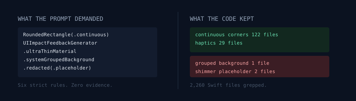
Rather than claim causation, I counted fingerprints. Every API name the prompts pin is a greppable string. I swept 2,260 Swift files and 243 Kotlin files.
iOS (SwiftUI) — rules that survived
| What the prompt demanded | Measured in code |
|---|---|
RoundedRectangle(style: .continuous) |
122 files / 313 sites |
UIImpactFeedbackGenerator haptics |
29 files |
.ultraThinMaterial |
33 files / 41 sites (85 including other materials) |
AsyncImage |
29 files |
iOS — rules effectively ignored
| What the prompt demanded | Measured in code |
|---|---|
Color(.systemGroupedBackground) background |
1 file |
.redacted(reason: .placeholder) shimmer |
2 files |
Exactly .spring(response: 0.3, dampingFraction: 0.7) |
2 files (springs in general: 17 files) |
Android (Compose) — ignored almost entirely
Across 56 Compose files: rememberRipple 0, Modifier.scale 0, shimmer 0, Coil 0. What survived was animateFloatAsState in 2 files and a single indication = null.
Games (web) — the HUD and glass rules survived (backdrop-filter in 16 sites, navigator.vibrate haptics, 0.95 scale). But section 4, the ImageGen asset strategy, I have never actually used. The four shipped games contain zero sprite assets. Everything is drawn with shapes and canvas.
How to read the gap
Three different causes — and none of them automatically mean "fix the prompt."
- Shape rules survive. Corners, haptics, materials are one-line and local, so they endure refactors. 313 sites is the proof.
- Global rules lose to branding.
systemGroupedBackgroundin one file is not a failure, it is a deliberate departure. Each app uses its own brand accent and ambient background tokens, so the system gray got replaced in the second pass. The scattered spring values (0.55/0.86,0.28/0.78) are the same story — hand-tuned per screen. - Rules do not port across stacks. Android shows this exactly. Both apps are ports of iOS, and the prompt only exerts force on screens drawn fresh. It had no effect on porting work.
What would you do here? Tighten the prompt to raise compliance, or delete the rules that never survive? I lean toward deleting. But that judgment came after running grep, not from intuition.
The skills I actually used for design
One prompt is not the whole stack. What runs alongside it:
- The frontend-design skill — aesthetic direction and typography guidance that forces choices which do not read as templated. If the prompt is the rulebook, this is the taste axis.
- First-principles forcing questions — "what is the one number that actually means something?" applied to design. This post's grep is a direct product of it.
- A reusable prompt/skill library — terse mode, YAGNI mode, an autonomy signal. Collected in the agent-taming post.
- Batch redesign orchestration — the procedure for repainting 30+ apps in one pass is in the one-shot redesign post.
- Verify games by making a bot play them — game UI looks great in stills. Only a headless run to the end catches the thing that dies at minute 45.
The honest part — clears the MVP bar, not the production bar
Here is the real weight class of what these prompts produce.
It clears: first impressions, screenshots, demos, review approval. It is unmistakably not the system-blue-plain-list screen. App Store review passes, and users do not bounce in the first three seconds. As a way to stand up an MVP fast, the cost/benefit is excellent.
It does not clear: production polish is decided in places a prompt cannot reach.
- Accessibility. Whether the layout breaks at the largest Dynamic Type size, whether the VoiceOver order makes sense — the prompt does not care.
- Performance. Stack materials and blur into every list cell and scrolling stutters on older devices. The AI thinks that looks nice and adds more.
- Consistency. Generate per screen and you get per-screen beauty. The spacing scale and tokens that run through the whole app still have to be fixed by a human.
- When the data is ugly. A 40-character title, a 404 image, a list with one item — generated layouts mostly break.
Net: it is a tool that finishes the first 70% of design in minutes. The remaining 30% is still hands — and that 30% is what separates production from MVP.
Three self-checks
- How many bans are in your UI prompt? Zero means it is a wish, not an instruction.
grepyour repo for an API name your prompt pins. How many hits? Zero means that rule does not exist.- Do you have screenshots of the Empty, Loading, and Error states — or only the happy path?
What it shipped into
The shipped artifacts these rules went into. Taste is yours to judge, so judge it directly.
iOS (App Store — a selection of the 28 live)
- Quieta: Tinnitus Tracker
- Aurnia: Sleep Tracker
- Plotta GPS: Territory Walk
- Solca — Social Battery Tracker
- Repvy: Strength Log & Coach
- Nomori: Nonogram
- Pixogue: Daily Pixel Puzzle
- Clearfield: Minesweeper
- Territory Arcade
- Itda: K-Word Chain Game
- RoadEye Pro: Live Road CCTV
- HiddenGem Korea
- Reelo: AI Video Editor
- Resolv: Quit Habit Tracker
- Aftershift: Recovery Routine
- Throne: Gut & Stool Log
Google Play
Web games / web apps
- Gori (daily connections)
- Hanbut (daily one-stroke puzzle)
- Relic Run
- Star Swarm
- Plotta web
- Full web app hub
Closing
Publishing a prompt is easy. The hard part is checking whether the prompt survived into the code. I counted for the first time this week, and half of it had not. Some of that was a decision I made; some of it was simply forgotten. Telling those two apart requires a number.
Do one thing right now. Pick a single API name out of your UI prompt and run grep -rl on your repo. How many files come back? If it is zero, that rule has not existed for the past month.